Introduction to Design
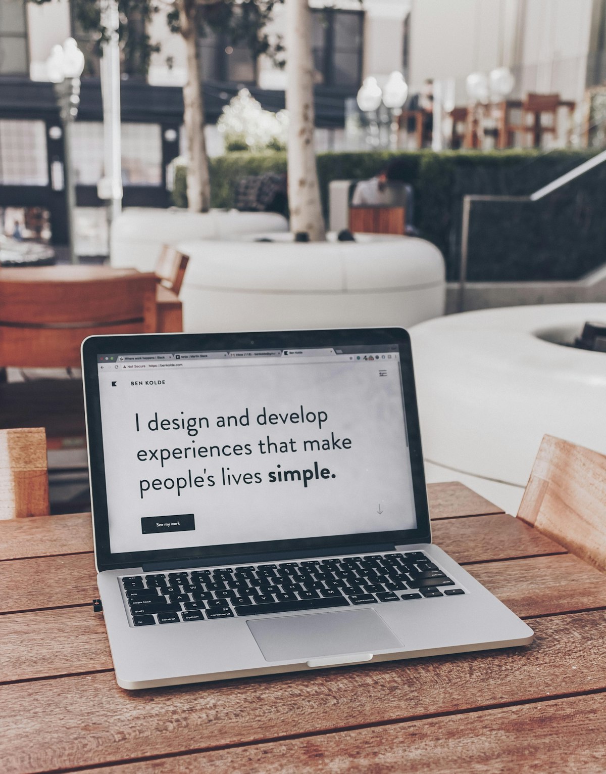
Design is a plan for arranging elements in such a way as best to accomplish a particular purpose.” ~~Charles Eames, an American designer.
Design Fundamentals
What is design?
Design is a plan or specification for the construction of an object or system, for the implementation of an activity or process, or the outcome of that plan or specification in the form of a prototype, product, or process. ~~Wikipedia
Design is a complex yet subtle process that entails more than just making things look nice.UI/UX design is both an art and a science.Please keep the following in mind as we proceed:
- Design isn't about originality
- Designers are not consumers
- Designers should be compassionate
- Design isn't a stage of the project , but rather it is a component of it.
- Design simplicity doesn't imply minimalism

Introduction to design Principles
Design principles are the rules that designers should follow to create effective and efficient designs. They are
Contrast:
Contrast is the difference between two or more objects in a design that makes them standout.

Balance
Balance is a pleasing arrangement or proportion of design elements. When there is an equally distributed amount of visual signal on both sides of an imaginary axis running through the center of the screen, there is balance. This axis is typically vertical, but it can also be horizontal.

Symmetrical Balance
Symmetrical designs place equal-weight elements on either side of an imaginary center line.
Assymetrical Balance
Asymmetrical balance employs elements of varying weights, which are frequently arranged about a line that is not centered within the overall design.
Emphasis
Emphasis is a strategy used to draw the attention of the viewer to a specific design element. This could be to a section of content, an image, a link, or a button.

Most fields of design, including architecture, landscape design, and fashion design, use emphasis. Even if you don't realize it, we are surrounded by emphasis.
Many things can be used by a designer to create emphasis, such as lines, shapes, color, textures, and so on.
Hierarchy
Hierarchy refers to the importance of elements within a design.How items are ranked against each other.

Hierarchy is determined by the order of importance rather than design styles. A good design guides the eye through each area in descending order of importance.
Rhythm
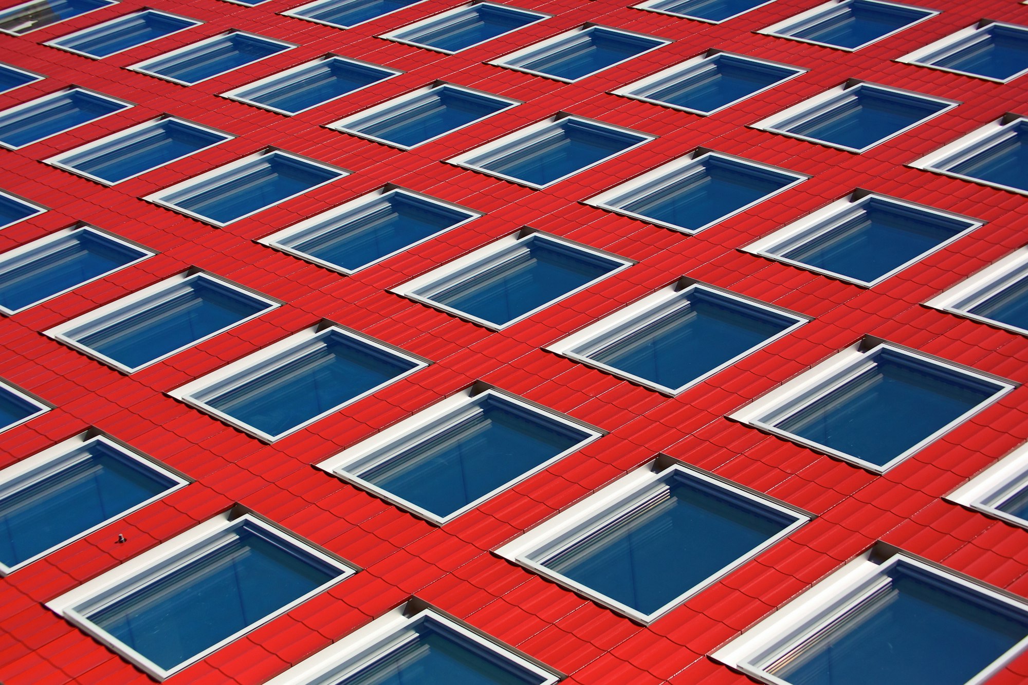
Similar to how the space between notes in a musical composition creates rhythm, the spaces between repeating elements can cause a sense of rhythm to form.The repetition of an object throughout the composition creates a pattern. We can use patterns to draw focus and emphasis on our subject by including them. They help to distinguish and remember the composition as a whole.
Proportion
This is the relationship between the sizes of elements. It can be used in conjunction with other principles such as emphasis to draw the viewer's attention to a focal point and aids in the interpretation of designs or imagery.
Repitition
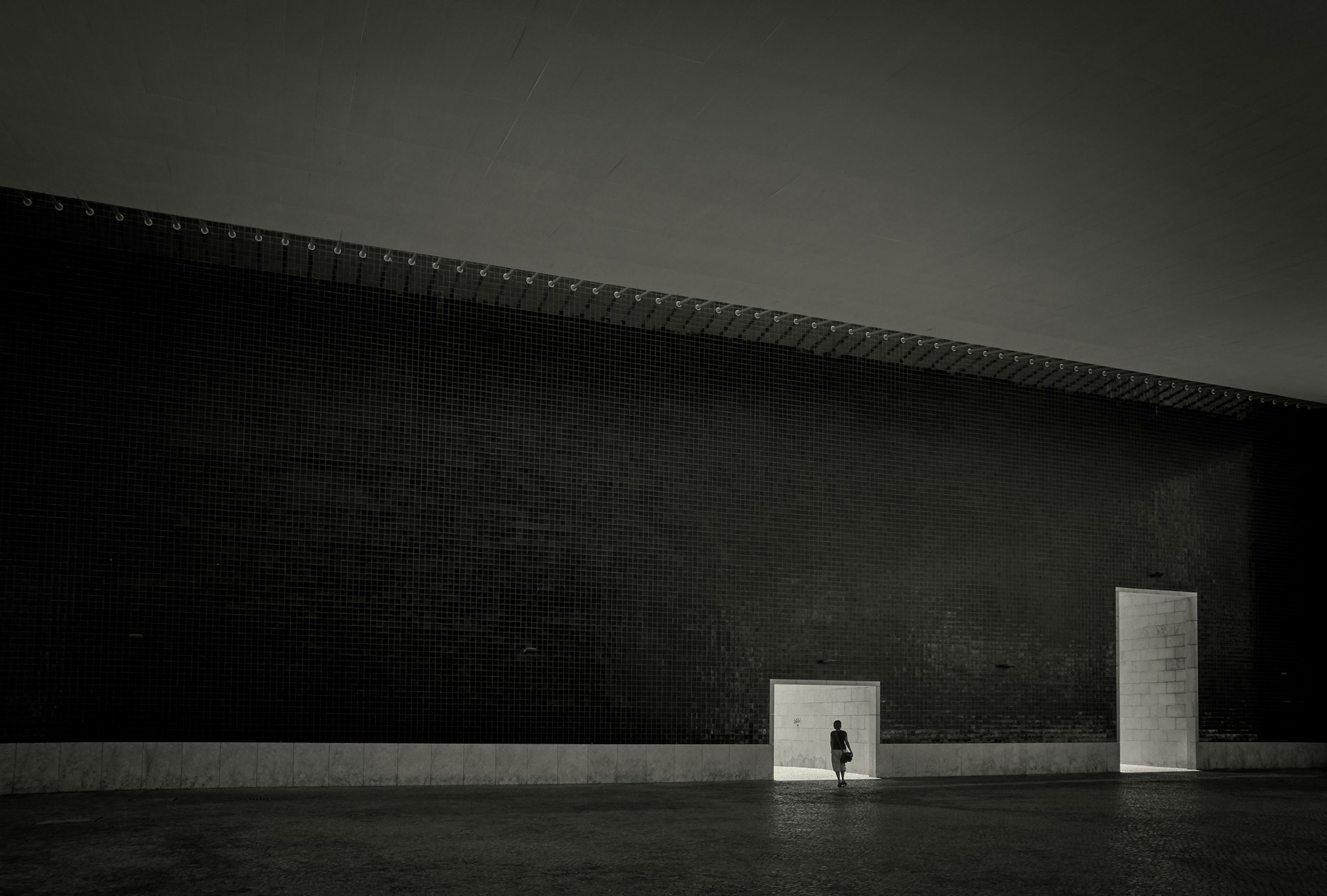
Repetition in design is used to create a design that draws the user's attention to a focal point, has continuity, or flows. Lines, shapes, forms, color, and even design elements are examples of repetitive elements.

Whitespace
Also Known as negative space is teh only one that specifically deals with what you don't add.
Movement
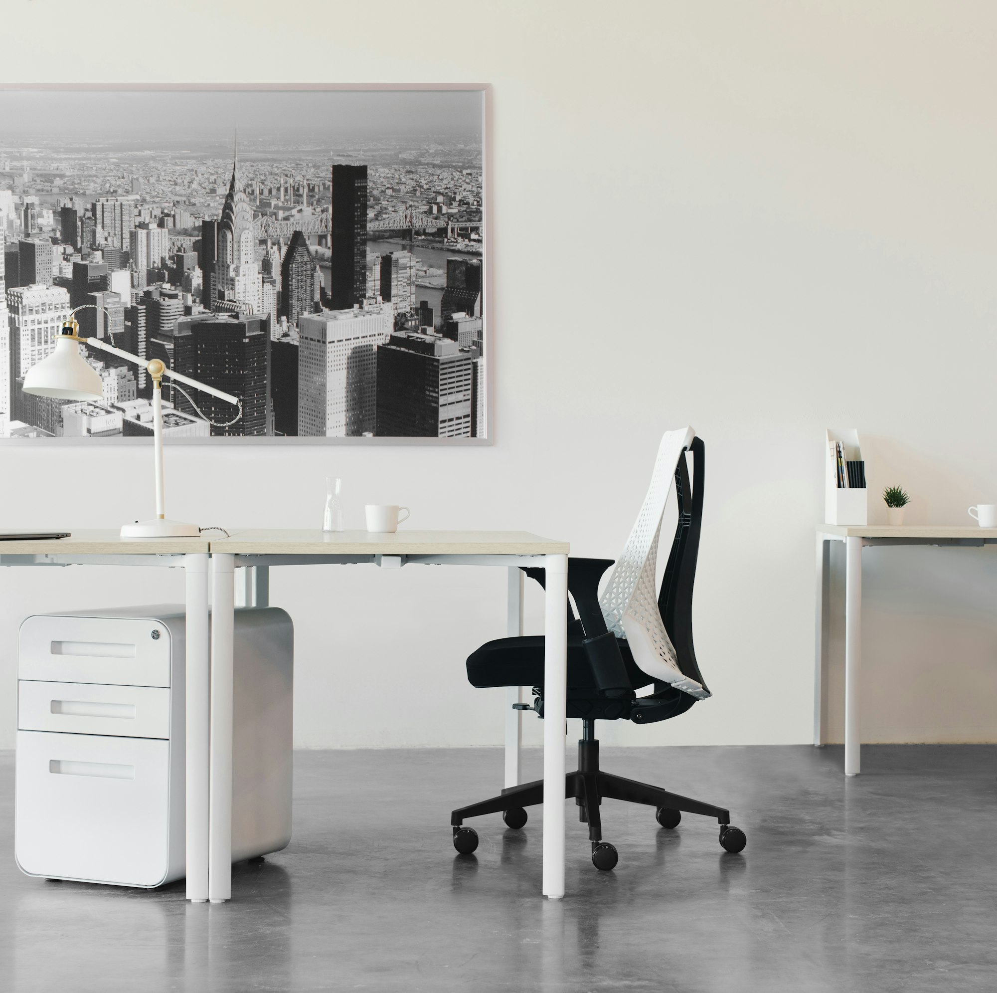
Controlling the elements in a composition so that the eye is led from one to the next and the information is properly communicated to your audience.

Variety
Variety is used to create visual interest. A design that lacks variety can quickly become monotonous, causing the user to lose interest. Variety creates users interest and keeps them engaged.
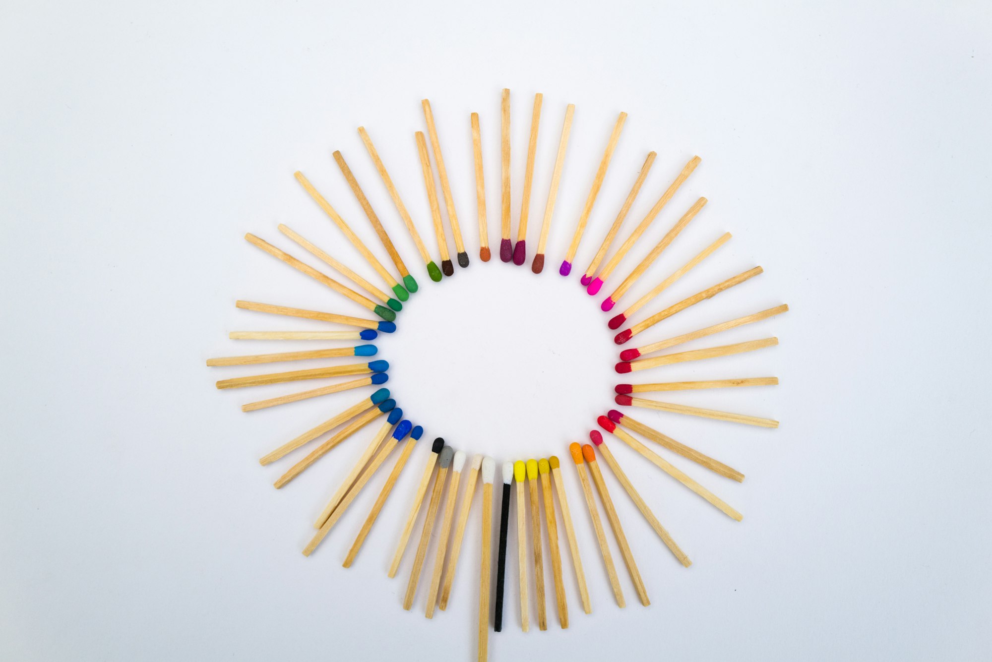
Unity
Unity is a force operating within a design that gives it the appearance of oneness or resolution. Simply Put it refers to how well elements work together to achieve eligiblity and visual hierarchy.

Pattern
This refers to design elements as seen in things like wallpaper.They can also refer to setting standards for how elements or certains shapes can be designed.


